TamannaUX

Redesigning ThyroApp


About Throapp
ThyroApp, powered by Thyrocare - India's leading diagnostic lab, is a healthcare platform that focuses on making healthcare accessible to everyone. It is a step in easing the blood test booking process and making diagnostic tests accessible to patients at home and on-the-go.
What does Thyroapp do?


Book Lab Tests
Family Packages and more
Download Reports anytime
Refer Friend
Read Articles

Project Brief
The project was meant to focus on redesigning the UI of the ThyroApp, solely aiming at the visual aspect of the interface.
Limitations
-
The Brand colour i.e should be kept unchanged.
-
Information can’t be removed or added.
-
There should not be UX based approach.
Duration
5 Weeks
UX Audit
The project initiates with a UX Audit of ThyroApp. We evaluated the platform on the basis of the Ten Heuristic usability principles.
We have marked our observations into the following three buckets - Roadblock Problem, Moderate Problem and Cosmetic Problem - each having their own implications and impacting the end user experience of Throycare -Mobile application.


Competition Analysis
The project is then followed with a Competition Analysis phase, where each screen and its associated tasks are meticulously dissected using heuristic principles.

Orange Labs
practo
Apollo
PharmEasy
PhleboIndia
SRL Diagnostics
Dr. Lal Path Labs
Dr. B Lal Labs
Bench Marking
Benchmarking refers to the practice of evaluating and comparing the usability and user satisfaction of a product or service against established standards, industry norms, or competitors' offerings.
Appointment Booking

Getting Started


Composition and Layouts
After Bench Marking different medical applications, I tried different layouts and compositions for the screens. I considered various usability practices of how a particular screen can be made more functional and aesthetic. From switching buttons to left or right to categorising information, every aspect was contemplated and reworked upon.


I made three different layouts for each screen considering scalability and affordances.
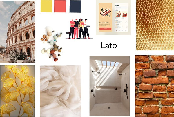
Mood Board
Keywords
-
Comfort
-
Cozy
-
Hopeful
-
Together
UI Style Guide
Brand Colors
Primary
F15F56
Semantic
F15F56
Secondary
2E3469
Neutral
F15F56
Accent
F1D856
FFFFFF
Typography
Lato
I chose Lato , a sans serif typeface for its clarity, its simplicity and its legibility since Thyroapp is a medical application for people of all ages.
Iconography
Input Fields
Nav. Bar
Hamburger Menu

UI Screens
Before
After


Getting Started
I made the Getting Started page minimalist and clean by providing the information in chunks and hence reducing the cognitive load.


Homepage
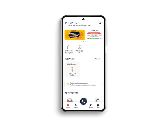
I redesigned the Nav Bar pairing icons with labels. I aligned the elements properly and improved the visual order by maintaining the icons family, illustrations and the colour theme throughout.


Appointment Page
I simplified the Appointment page by adding the Calendar for scalability and re-ordering the information as per it's importance.


Lab Test
I redesigned the Lab tests by providing an easy filtering option and opting out of the infinite scroll in the current app by using cards which look clickable unlike in the before version.
Screens


See More


